
IMPORTANT NOTE: Payhip have been so good at responding to requests to make shops more accessible that this tutorial is no longer relevant. Whilst there are still some problems, they are actively working on fixing them.
Over the past few weeks a lot of knitting and crochet designers have been adding their patterns for sale via Payhip, however their shop accessibility for purchasers is not very good. They have given us the ability to change options and add our own css to customise our shops, so I’m sharing a few fixes and workarounds that I have applied on my Payhip shop to make it as accessible as possible.
You won’t need to know any programming or css to implement these fixes. To make this tutorial useful to as many shop owers as possible, I’m going to give you the code and a photo tutorial on where to place it.
Please note that I am NOT a graphic designer so my shop has the same retro look as my website. The CSS and fixes I’m giving you below will not turn your Payhip shop into a clone of mine! They will, however, increase the accessibility of your shop for your customers. It doesn’t fix all the accessibility problems as we have limited editing capabilities, but does make a lot of things better.
Where Do I Customise my Payhip Shop?
Sign in to your Pahyhip account and you will be taken to your dashboard. On the top, right hand side of your screen you’ll see a star icon and the word “Account”. Click on that and a drop down menu will appear.
Click on “Design Editor”
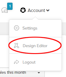
This will take you to the editing section.
Customising Your Shop
The Store Page
Firstly we need to increase the contrast on the follow button.
On the left hand side of your screen you’ll see the words “Design Editor”. Click on “Product Page” from the drop down menu on the right and choose “Store Page”.
You’ll want to change two things. Firstly, the colour code for the follow button. I made it a slightly darker shade of the original colour by changing the hex code in the background box to #3784A4. You can also change the hex code for the border if you want to.
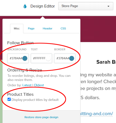
Next we need to display the titles of all of our products. At the bottom of the menu click the check box next to “Display product titles by default”. This means that users won’t have to hover their mouse over the product images to see what they’re called.
Finally for the store page, we’re going to add some custom css to fix a few issues.
Click on “CSS” at the top of the editing menu. You will see a re-sizable text box in which you can paste your custom CSS code.
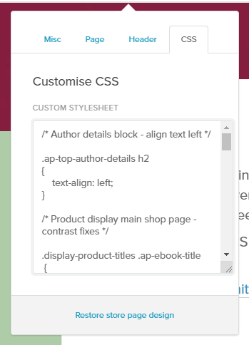
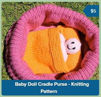
First of all, we’ll darken the colour of the backgrounds for the product titles and the little flags that show the price.
Copy and paste the following the following code into this box.
/* Changes the background colour on product titles and the price flags to increase readability */

.display-product-titles .ap-ebook-title
{
background: #0a5f91;
padding-top: 2px;
padding-bottom: 2px;
}
.ap-ebook-price {
background-color: #0a5f91;
}
/* Triangle before price */
.ap-ebook-price:before {
border-right-color: #0a5f91;
}
Next we’ll turn off the animated effect when hovering the mouse over a product and replace it with an outline. We’ll also make the outline around the product when a person navigating our shop using a keyboard has landed on the product. This is called “focus”. We want keyboard users to know when they have focus on links so they know what they’re “clicking” on when they hit the enter key.
/* Turns off the animation when hovering the mouse over a product */

.display-product-titles .ap-ebook:hover
{
transform: none;
}

/* Makes an outline around products when a keyboard tabs to the product so people using a keyboard to navigate know where they are on the page */

.display-product-titles a.ap-ebook:focus, .display-product-titles .ap-ebook:hover
{
outline: 5px solid #0a5f91;
outline-offset: -5px;
}
The final piece of code makes the links in the footer more visible, and makes it more obvious when someone is hovering their mouse over a link. The word “Payhip” in the image below shows the way the links look when a mouse is hovering over them. Note: the background colour of my shop is a greyed light green, however yours will be grey if you have left it at the default colour.

/* Footer contrast and font size fixes. Bigger fonts with more contrast. */

.profile-page-footer
{
font-size: 1.2em;
color: #333;
}
.profile-page-footer a
{
font-size: 1.2em;
color: #333;
}
footer-more-section a
{
font-size: 1.3em;
color: #333
}
.profile-page-footer a#footer-show-more-link
{
color: #555;
}

/* Footer hover fixes. Makes it more obvious when a mouse is hovering over on of the links at the bottom. */

.profile-page-footer a:hover, .profile-page-footer a#footer-show-more-link:hover, #footer-more-section a:hover
{
color: #fff;
background: #0a5f91;
}
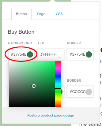
The Product Page
In the design editor menu, choose “Product Page”. The first thing we’ll change is to darken the background colour of the button. I changed mine to a darker version of the default colour by using the hex code #37754E
If you want to change it to a different colour, choose something from around the middle of the popup colour chooser. You can change the colour by sliding the rainbow coloured slider around. Don’t choose a light colour like cyan or yellow though. The best colour to choose is cool, such as blue or green, slightly darker than the mid range of the colour chooser, and slightly greyed. If you would like to, change the border colour as well.
Now we’ll fix the text size, contrast and hover on the footer links in the css panel as we did for the shop page. This code will also darken the currency sign. In the css panel paste the following text.
/* Footer contrast and font size fixes */
.view-page-wrapper .view-page-footer, .view-page-footer a, .view-page-wrapper .view-page-footer a#footer-show-more-link, .meat-skirt-right .price .price-dollar
{
font-size: 1.2em;
color: #333;
}
footer-more-section a
{
font-size: 1.3em;
color: #333
}
/* or */
div.or-separator
{
font-size: 1.3em;
color: #000;
}
/* Footer hover fixes */
.view-page-footer a:hover, .view-page-wrapper .view-page-footer a#footer-show-more-link:hover, #footer-more-section a:hover
{
color: #fff;
background: #0a5f91;
}
.view-page-wrapper .view-page-footer a:hover
{
background-image:none;
}
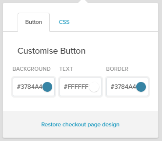
The Checkout Page
In the design editor menu, choose “Checkout Page”.
Under “Customise Button”, make the background and border colours the same as you did on your “Follow” button on the store page. I chose to make a slightly darker shade of the default colour, #3784a4
Now we’ll fix the text size, contrast and hover on the footer links in the css panel as we did for the shop and product pages. This will make all of the pale grey text larger and more visible.
In the css panel paste the following text.
/* Fix the contrast of pale grey text */

label, p.input-label, div.cart-reminder-wrapper, .price-large-wrapper .currency
{
color: #333;
}
/* Darken and make larger - Secure payment with account or card via PayPal, footers and text */

.home-section .security-message-paypal-only-wrapper .security-message-text, .checkout-footer .powered-by-badge, .checkout-footer .checkout-footer-right a
{
font-size: 1em;
color: #000;
}
.checkout-footer .checkout-footer-right
{
padding-top:3px;
padding-bottom:3px;
background-color: #f4f4f4;
}
Other Things to Consider
The Product Page
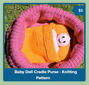
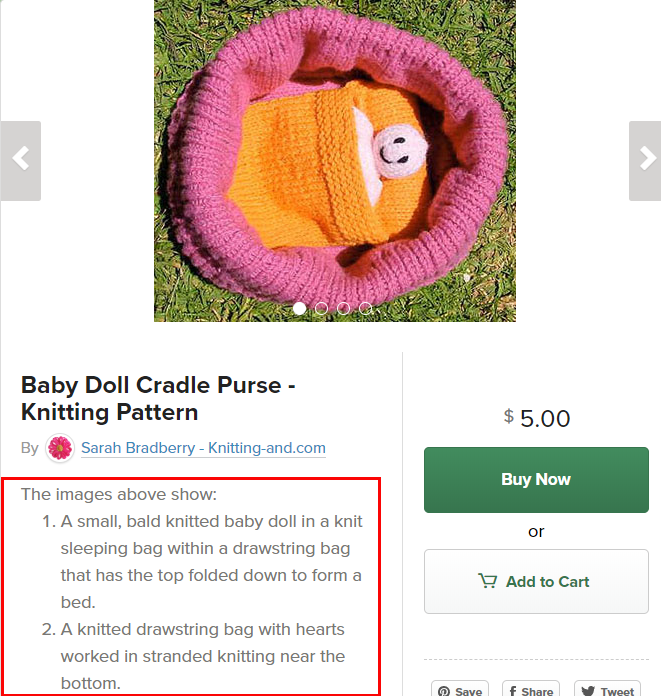
If your product has more than one image, make sure thay are all the same height so the text on the page doesn’t move up and down the screen when your visitors click through the image carousel.
Since we have no way of adding alt text to our product photos in the carousel, adding descriptions of the photos in the product descriptions will at least tell visitors what they are if they can’t see the pictures for whatever reason.
These were all the accessibility fixes I managed to make to my shop, some remain that I was not able to fix.
If you found this tutorial useful please share it, or if you have any tips on making more changes to Payhip shops please leave a comment below.
Additional Code Added July 13th 2020
The Store Page
As I’ve learnt more about the CSS on Payhip, I’ve been able to make more accessibility changes. Adding the following code to the CSS of the Store Page will:
- Change the look of the “Follow”, Share, and Collections buttons when users hover their cursor over them.
- Increase the size of the font on the Collections buttons.
/* Make hover on follow button evident by changing the background to grey and the text blue*/

body > div.ap-wrapper > div.ap-top-author-details > div.ap-author-details-button-wrapper > div.default-state > a.btn.btn-primary.btn-blue.initial-follow-button:hover
{
color: #0a5f91;
background-color: #D3D3D3;
background-image: none;
}

/* Increase the size of the text on the collections buttons and make them change colour on hover. Background changes to blue and the text changes to white */

.ap-collections-wrapper a
{
font-size: 1em;
}
.ap-collections-wrapper a:hover
{
color: #fff;
background: #0a5f91;
}

/* Make the share button change colour on hover. Background changes to blue and the text changes to white */

body > div.ap-wrapper > div.ap-top-author-details > div.ap-author-details-button-wrapper > div.default-state > a.btn.btn-default.dripicons-upload.display-share-seller-profile-button:hover
{
background: #0a5f91;
}

body > div.ap-wrapper > div.ap-top-author-details > div.ap-author-details-button-wrapper > div.default-state > a.btn.btn-default.dripicons-upload.display-share-seller-profile-button:hover::before
{
color:#fff;
}
I am trying to find out if I can also change the font of the share button so I can make it say “Share” instead of using an icon. If I can, I’ll update with more information here.
The Product Pages
Adding the following code to the CSS of the Product Page will change the colours of the “Buy Now” and “Add to Cart” buttons when users hover their cursors over them. It will also increase the size of the text on the “Add to Cart” button.
/* Change the colours of the Buy Now button when hovered. The background changes to grey, and they text to green */

.view-page-wrapper .meat-skirt-right a.buy-button:hover
{
background-color: #d3d3d3;
color: #37754E;
background-image:none;
}

/* Change the colours of the Add to Cart button when hovered and increase text size. The background will change to blue and the text will change to white */

.btn.btn-default.btn-default-line-green:hover
{
background-color: #0a5f91;
background-image:none;
}
.view-page-wrapper .meat-skirt-right a#add_to_cart:hover {
color: #fff;
}
.add-to-cart-buy-page #add_to_cart
{
font-size: 1.2em;
}

See also: Part two of this article for more tips for editing your Payhip store.